Ferreira Porto Classics
A train trip to the past
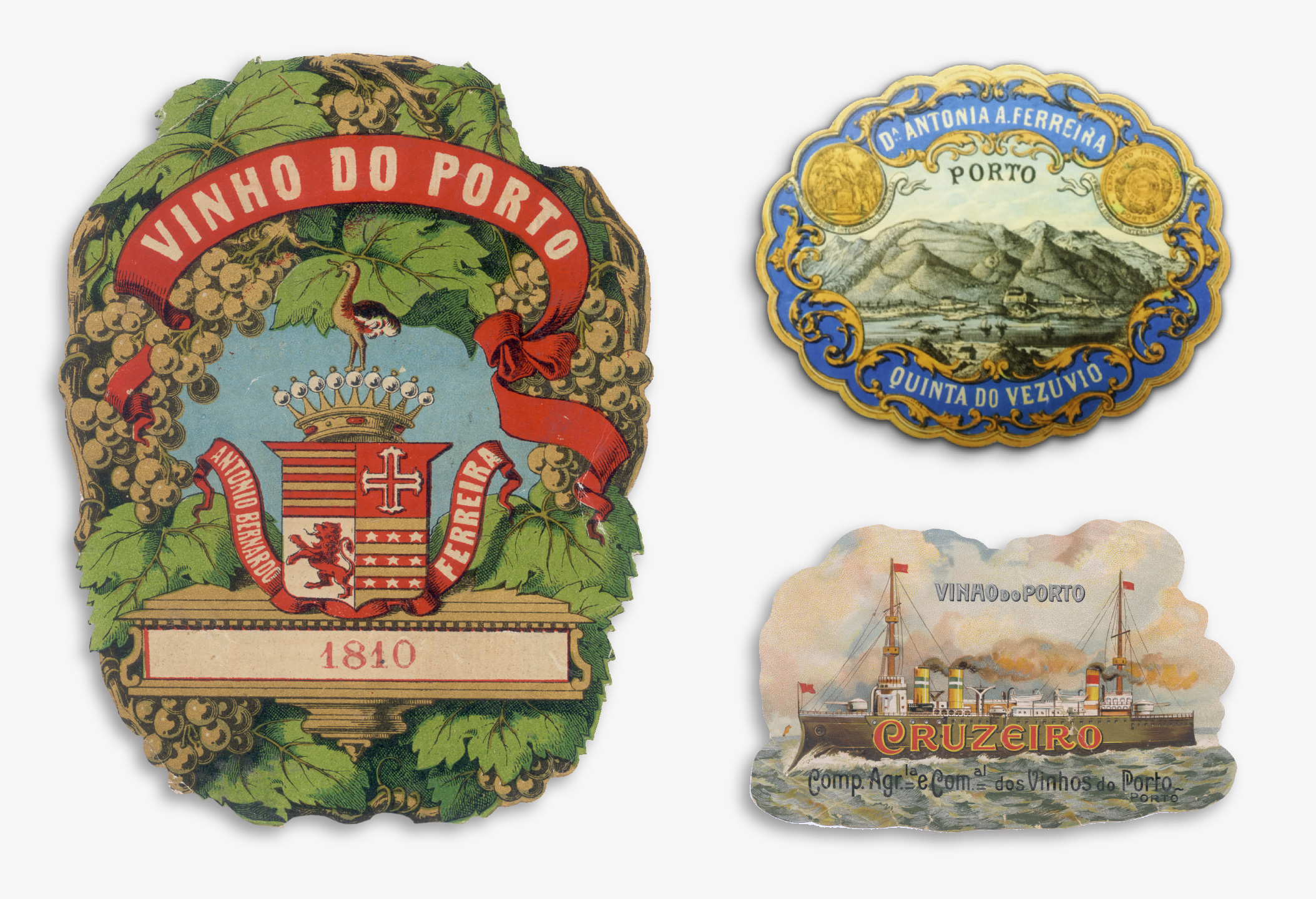
Ferreira is one of the oldest & most charismatic Porto wine brands. With its more than 250 years of history, it honours and continues the legacy left by Dona Antónia Ferreira, the iconic woman that in the 19th century helped transform the company into one of the biggest and best wine producers in the Douro. Her entrepreneurial and dynamic mindset is still present today, on a brand that is always evolving.
Categories
Packaging DesignLabel Design
Communication
AWARDS
Clube de Criativos / Bronze - Labels

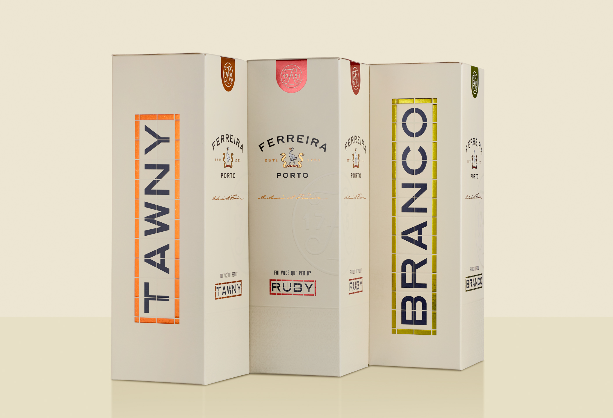
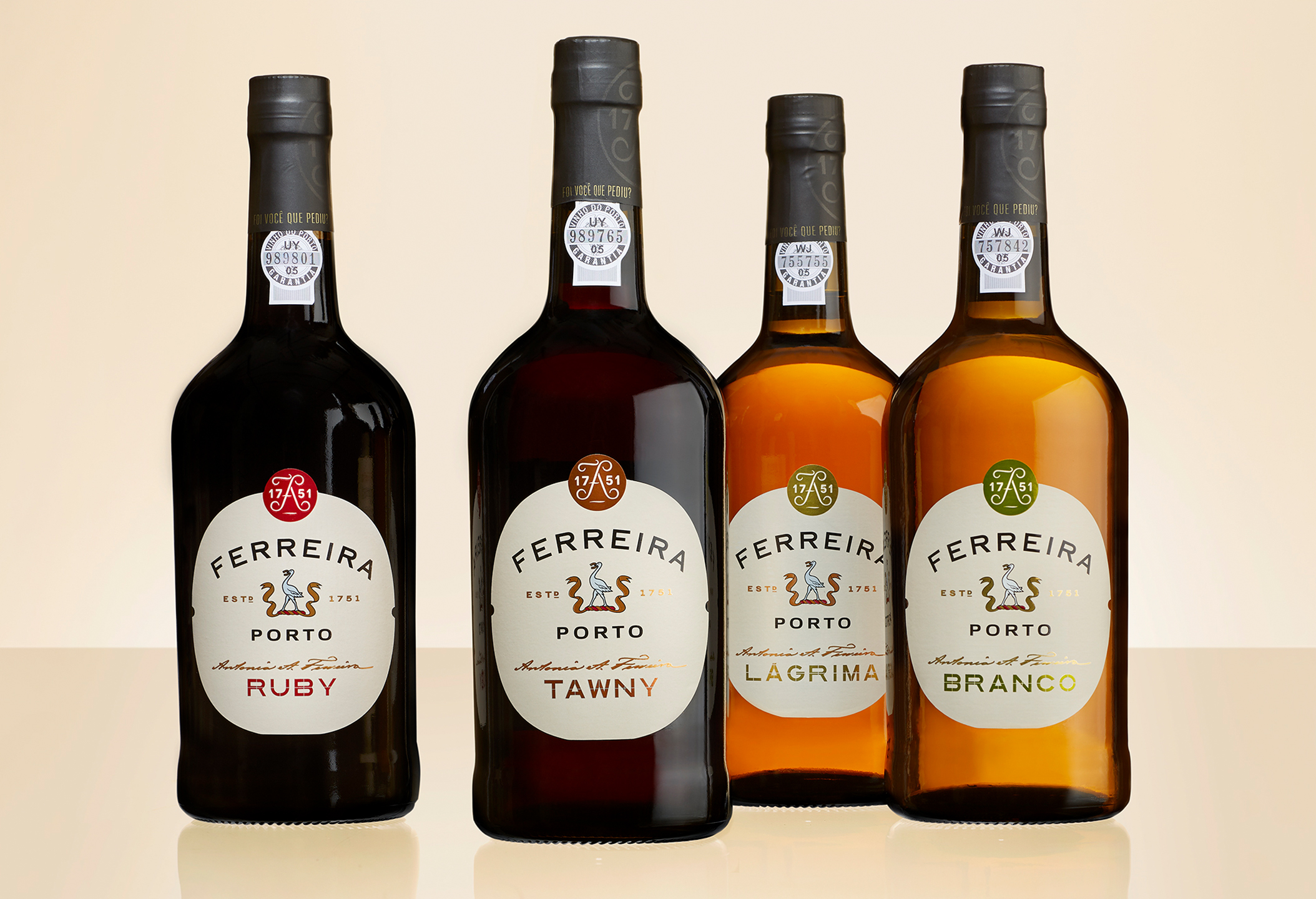
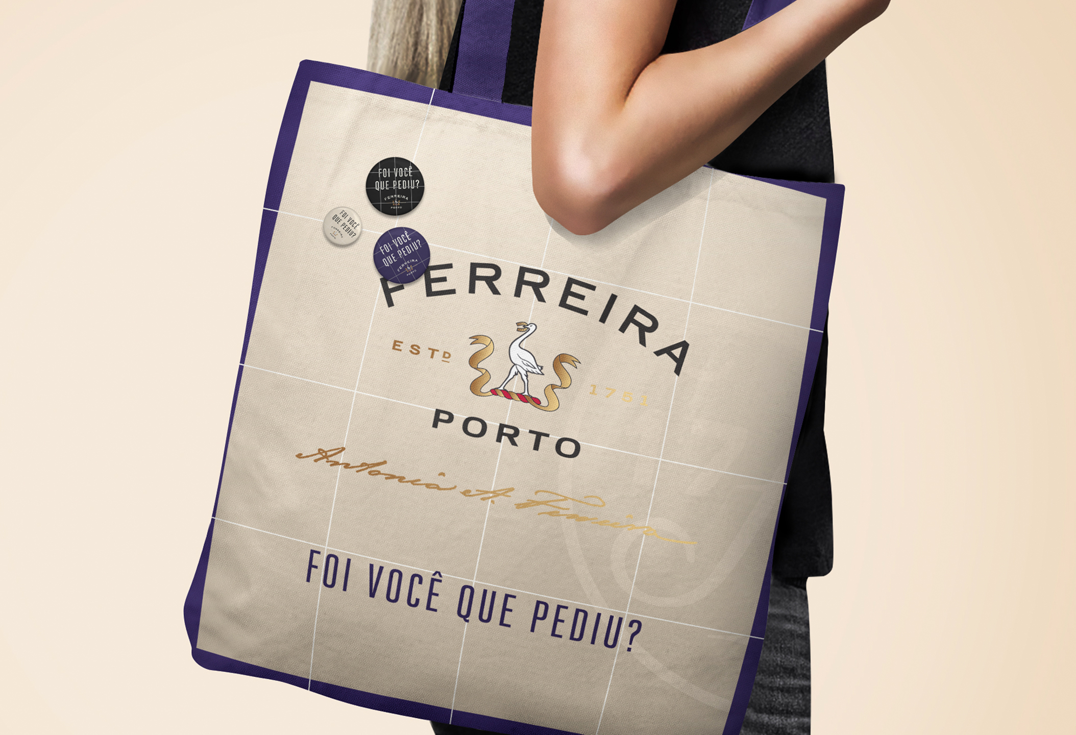
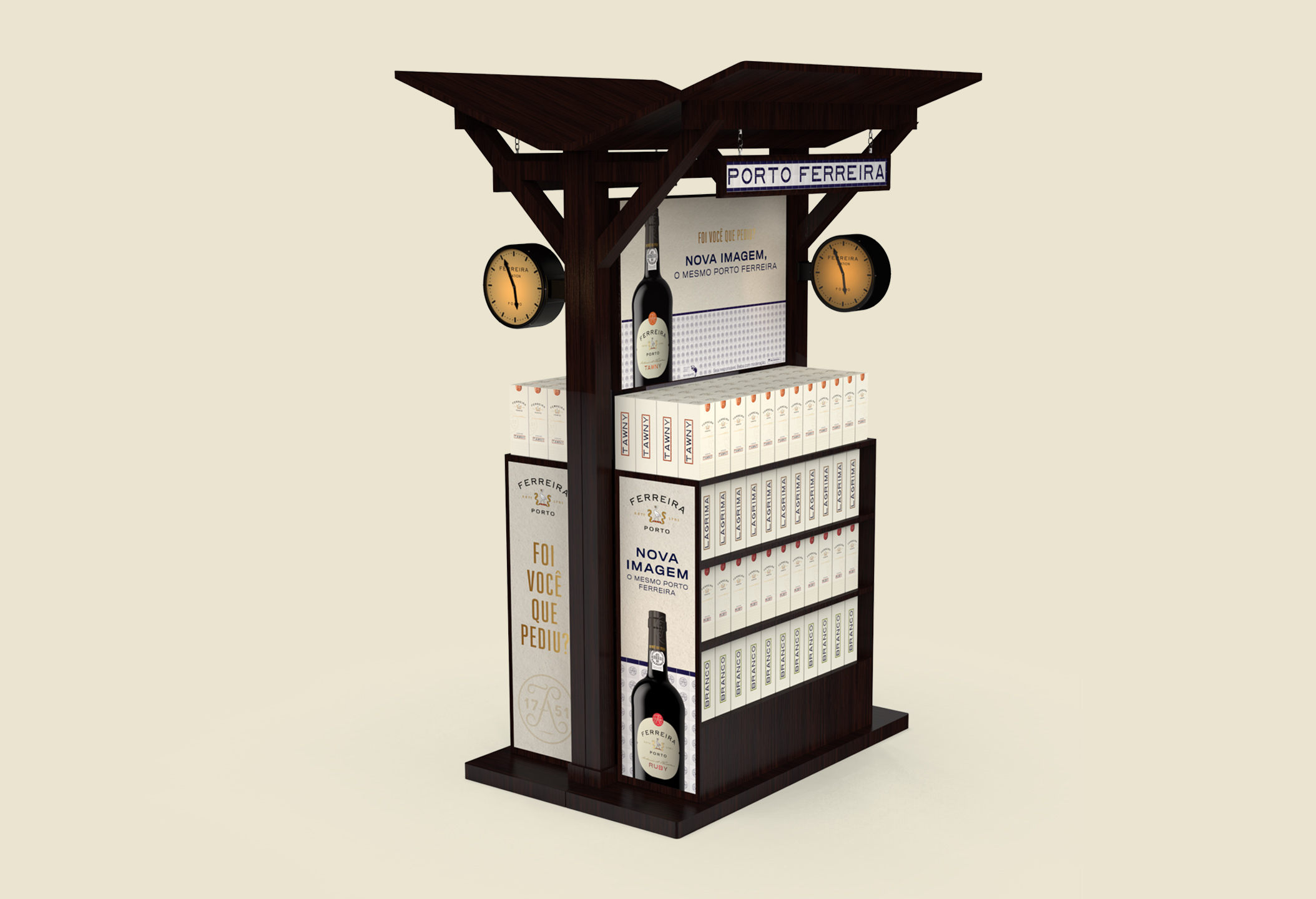
They approached Volta Studio to redesign their classic range wines image: Tawny, Ruby, White and Lágrima. These wines have a fierce shelf competition, so this redesign had to totally differentiate the brand from its competitors, without alienating its faithful consumers.
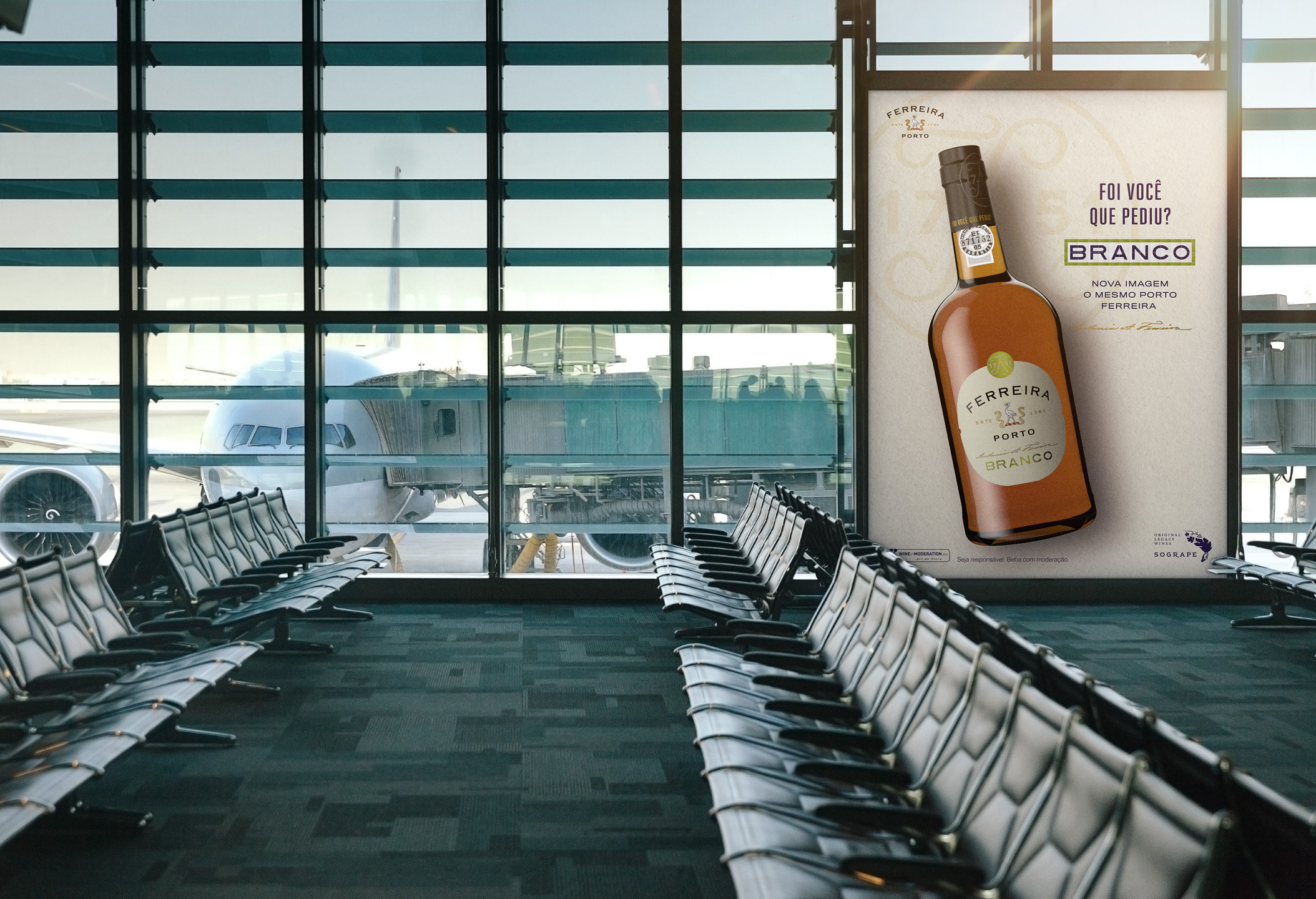
The labels and packaging should emphasize the brand’s rich history, specifically its origins and proud portuguese heritage, reinforce the emotional/historic connection with their consumers and recover their famous and timeless slogan “Foi você que pediu?” (“Did you ask for Ferreira?”).


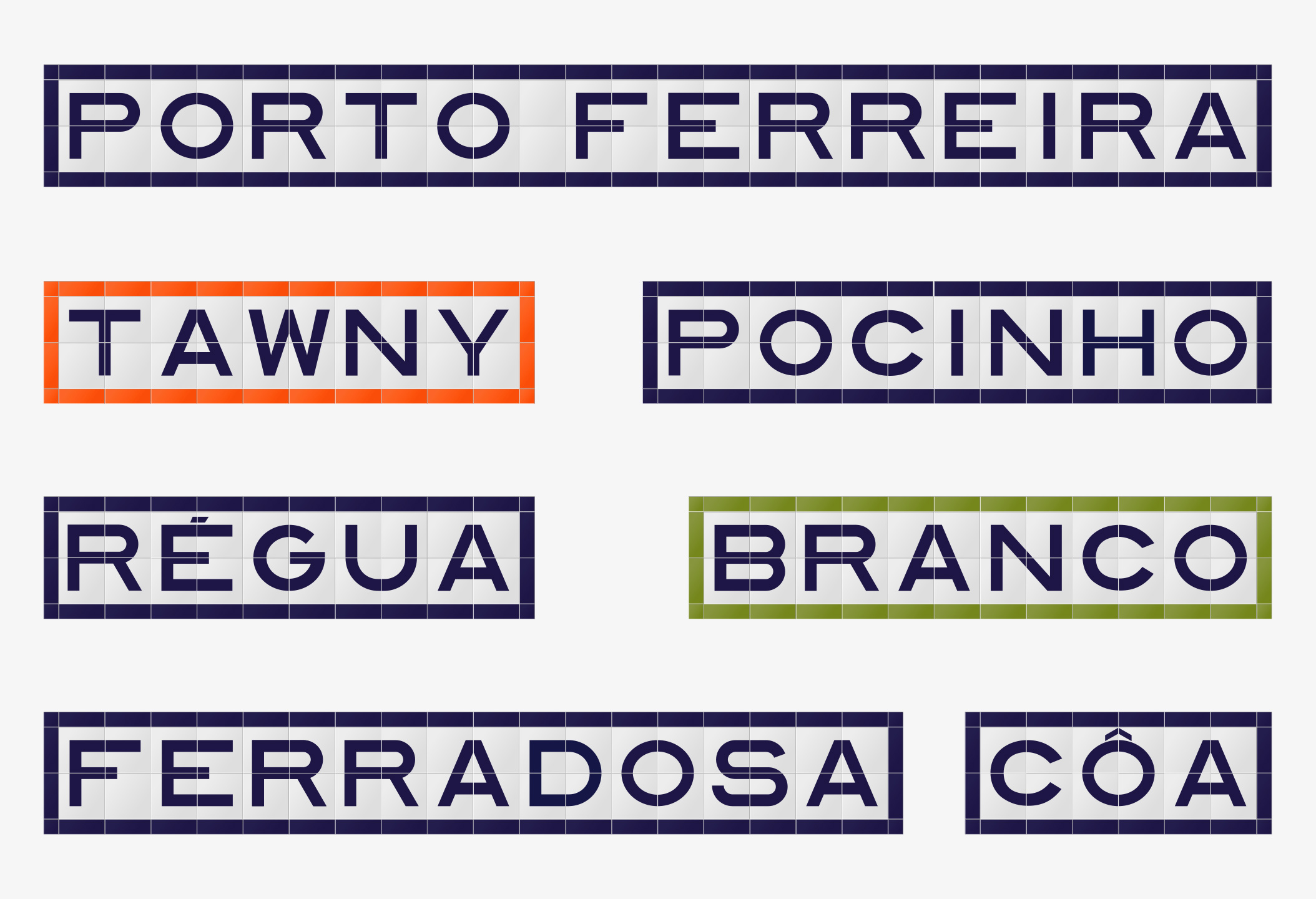
We also drew inspiration from the Douro railroad line: Dona Antonia invested time and money in this railroad to help the development of the business, the region and its community. The railroad stations layout and its iconic vernacular modular typography were the basis for our graphic layout, giving Ferreira’s new image a punchy (yet classic) and truly meaningful look & feel.
This modular typography is a graphic icon of the Douro itself. Using it on Ferreira’s labels and packs is celebrating Portugal, the Douro and its people while reinforcing the brand’s proud portuguese spirit.